Creating a design system for a successful cost visibility platform
Services provided
UX Design
UI Design
Design System
The client
Kubecost is a cutting edge platform that helps large companies monitor their cloud spend and optimize it.
Before Kubecost companies would spend huge amounts of money on cloud costs with virtually no idea where their money was going. With Kubecost, companies can make informed decisions on where to ramp up or dial back spending. Truly revolutionary!
How did we help?
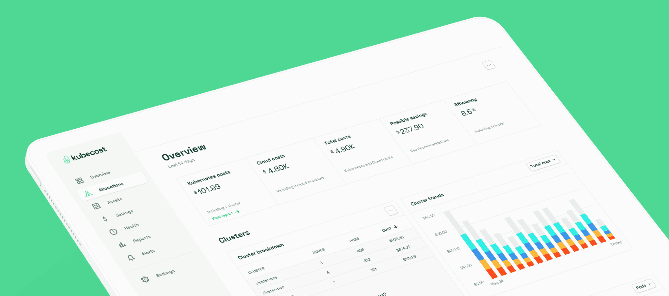
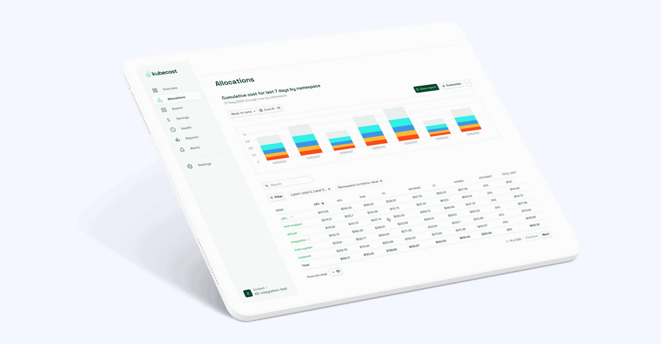
Kubecost approached us to deliver a complete overhaul of their product UI. We delivered a fully redesigned UI, complete with specifications for each page in their product and an extensive design system style guide.
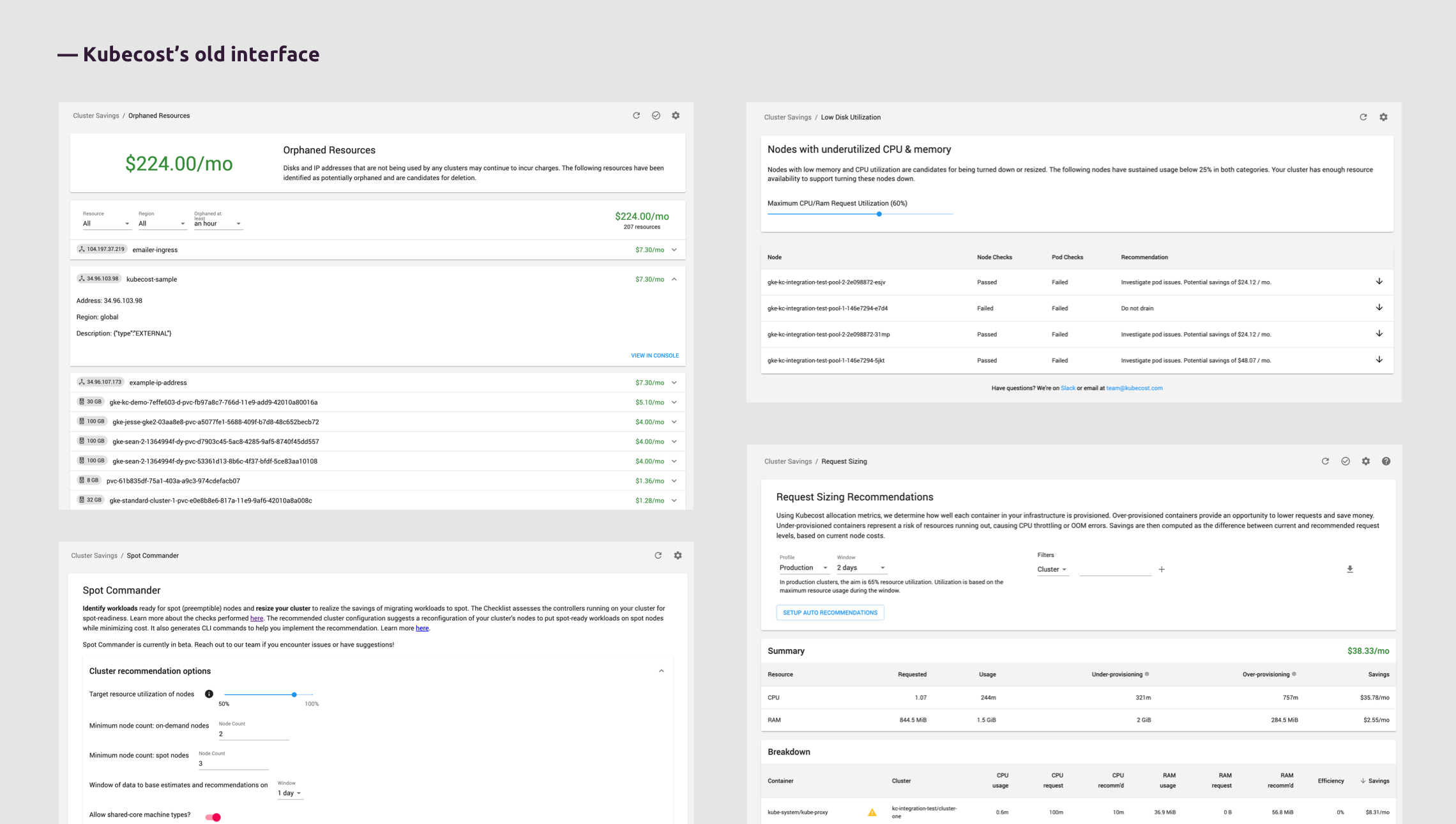
The previous interface
We were approached by Kubecost to revamp the look-and-feel of their existing interface. We also worked to add scalable structure to the pages and components.
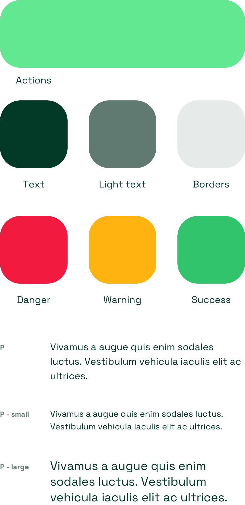
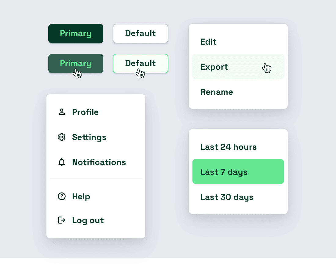
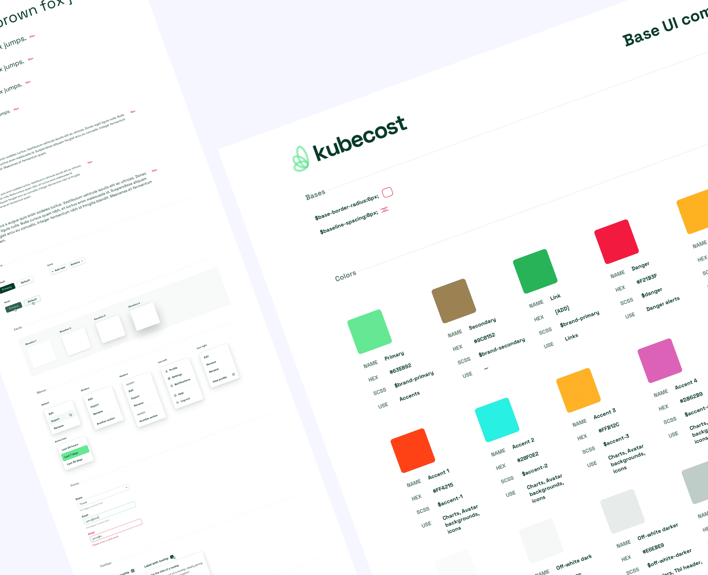
Setting the foundation with color and type
We partnered with Kubecost to audit their existing product and user interface. As the first step in creating a new design system foundation, we outlined a color and type system based on their existing brand guidelines.
By assigning meaning to color and establishing a simple text hierarchy from day 1, we used these foundational elements as the core building blocks of our new consistent user experience.
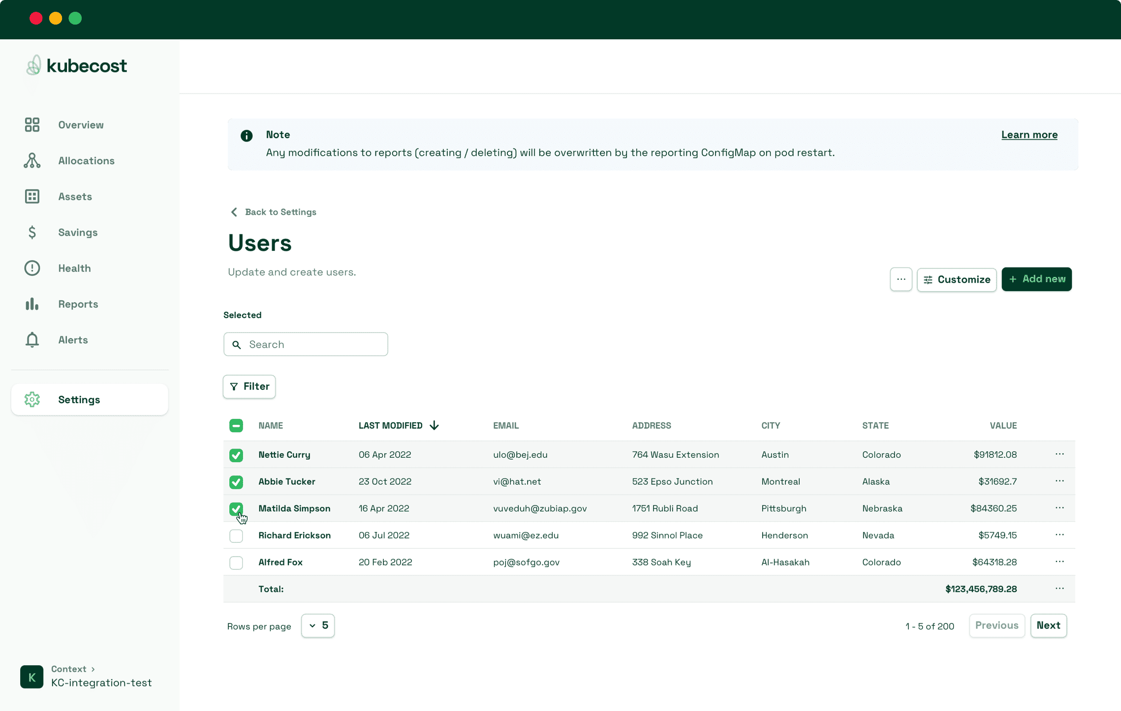
Standardizing the page layout for scale
Before designing each specific page in the Kubecost product, we established an overall page layout for placement of things such as titles, actions, breadcrumbs and content. While each page has a unique set of constraints, starting here ensures every page is built from a standard base, ensuring the user experience feels consistent.
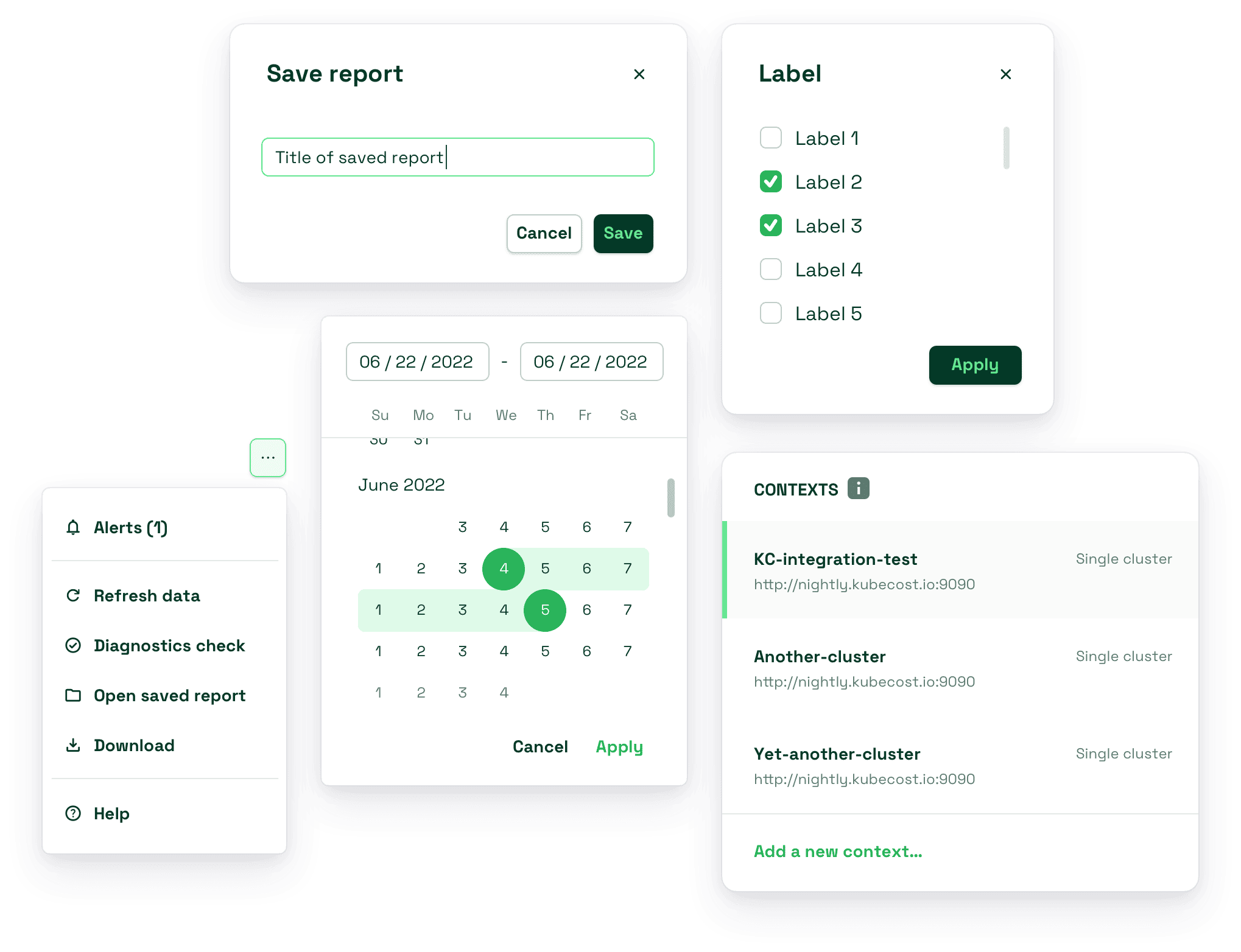
A design system rooted in functionality
We aimed to create a design system that could be used across all the varius use cases found in the Kubecost product.
The design language is meant to feel modern, clean and functional. Making use of font weight and color to drive an easy-to-identify visual distinction.
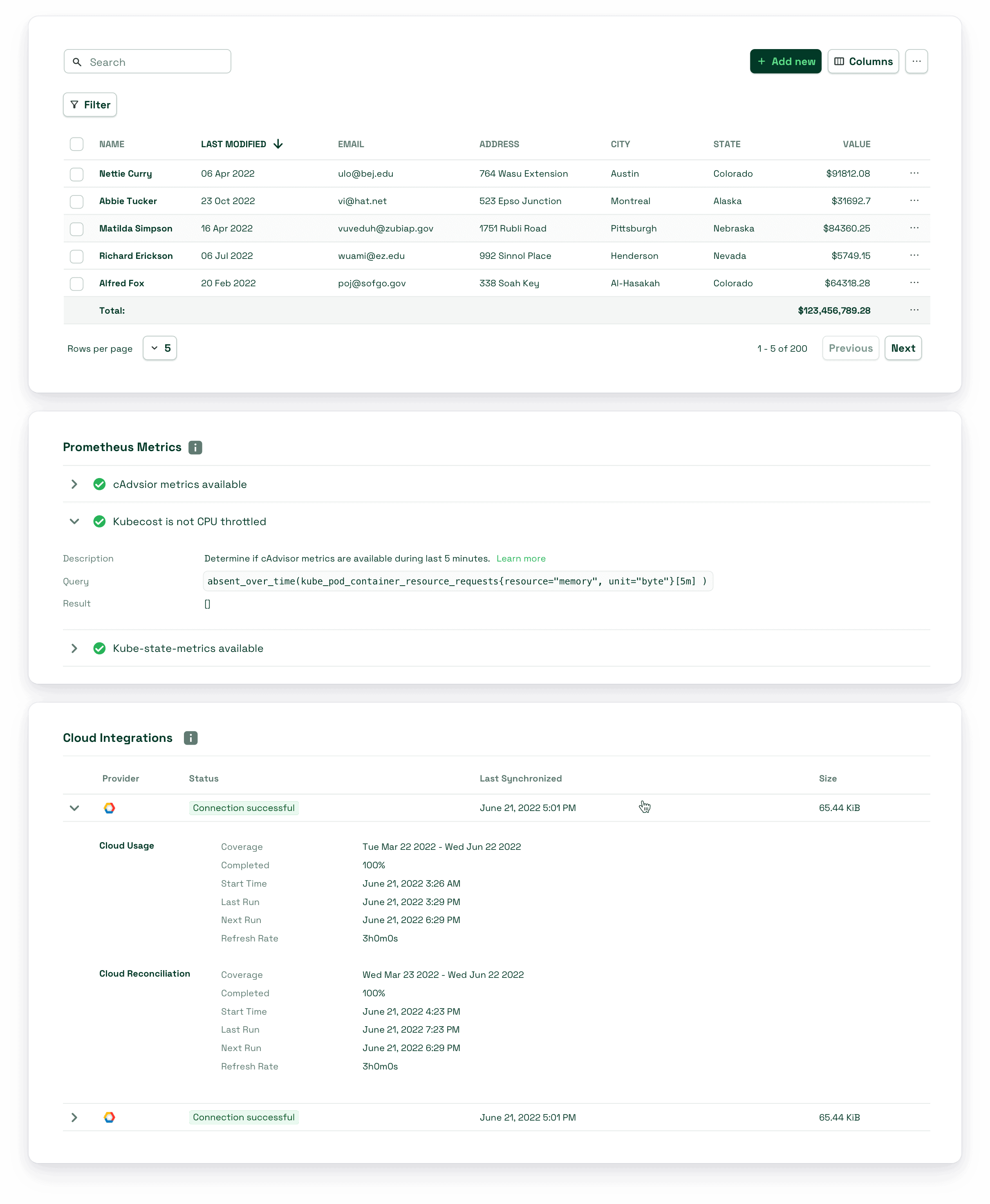
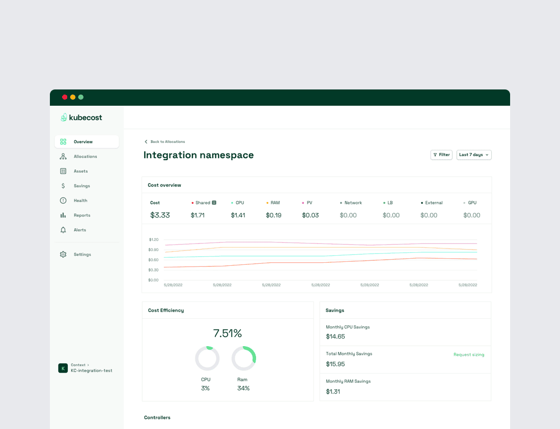
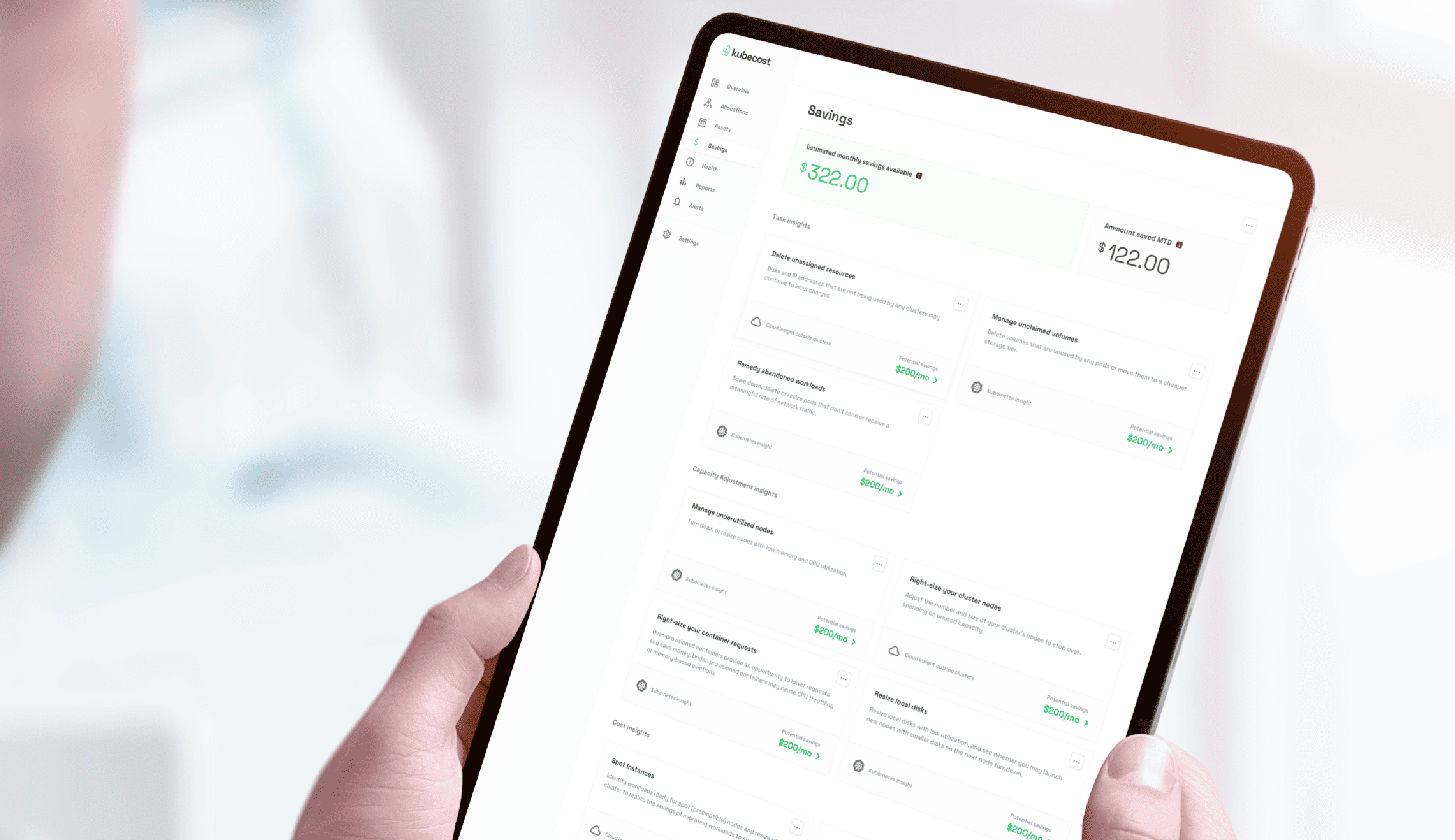
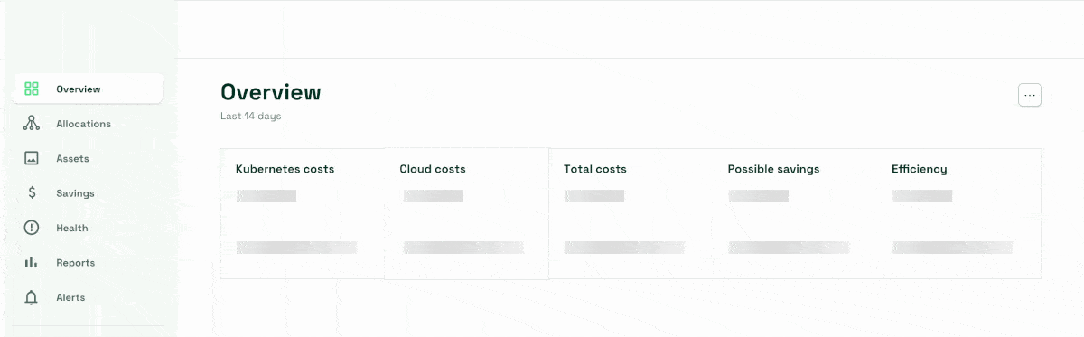
Information density is key
Because Kubecost consists of tables and displays with a lot of information, we designed the tables and other components to pack a lot of information into a small area, without loosing charity.
Components assembled into diverse page templates
With our design system foundation in place, we used our specifications to update each page in the Kubecost products, following the rules established by our system, ensuring we understood how to handle the nuances of each workflow.
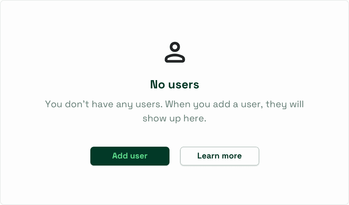
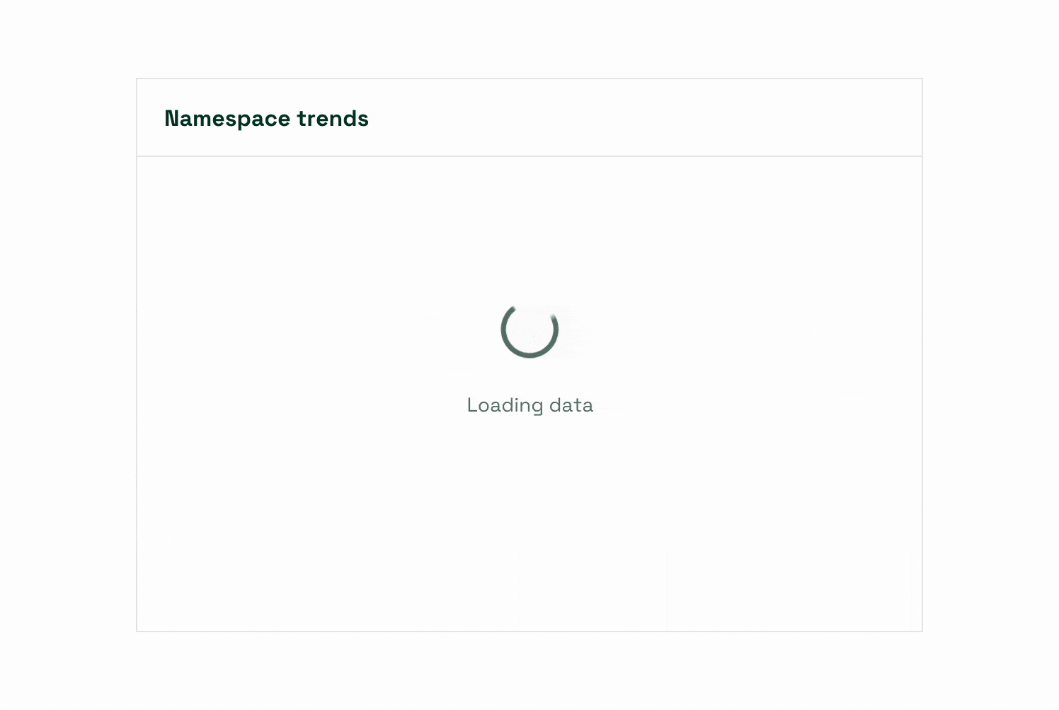
Additional details
We worked with Kubecost to consider and define the smallest details, including loading interactions and zero states. The final delivery consisted of a fully specced style guide, ready for future implementation and product scaling.
The result
In designing a thoughtful user interface to the Kubecost team, we were able to deliver an updated look-and-feel for their product that is easier to use and built to evolve in any direction the product may go.