New visual strategy for a premium software development agency
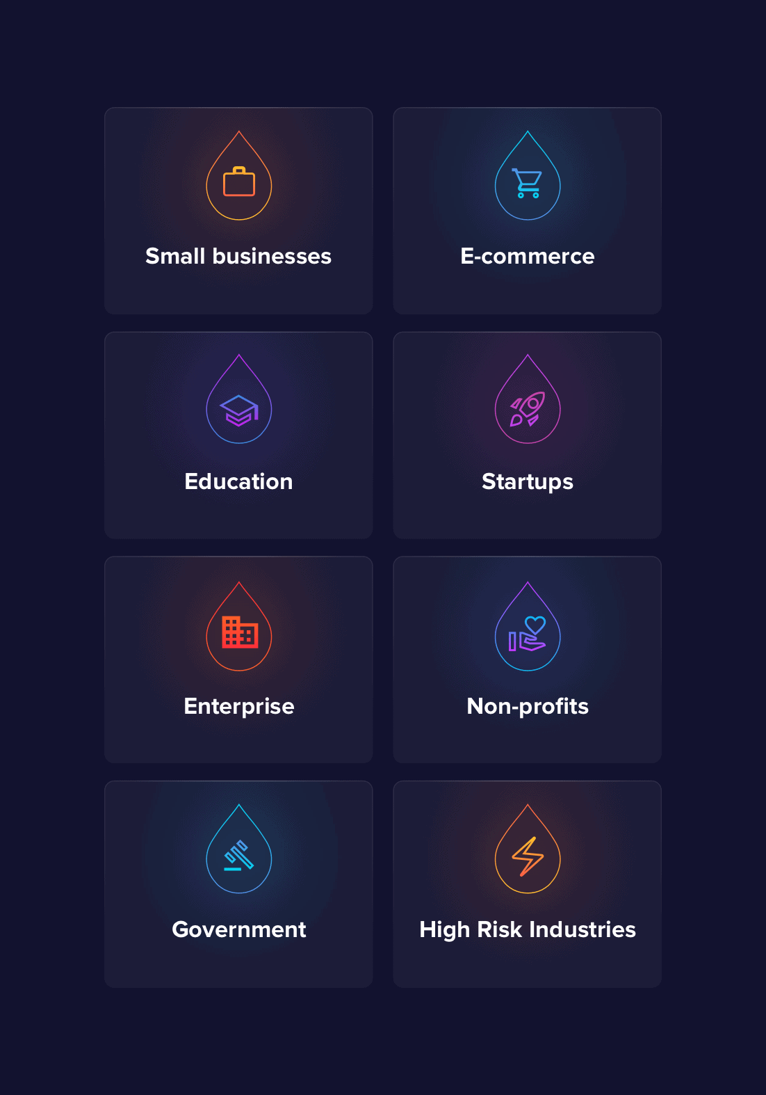
Services provided
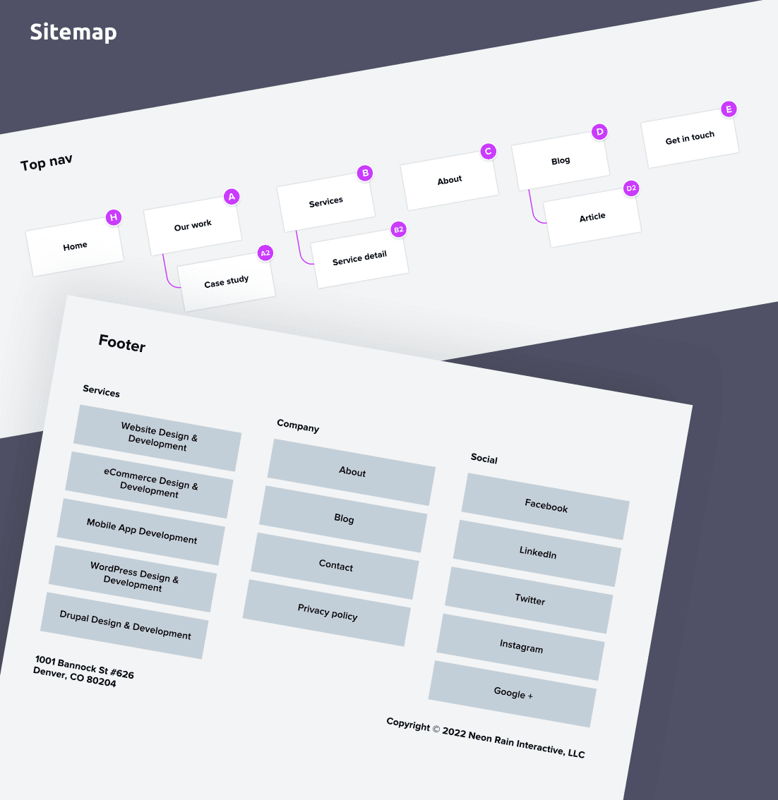
Sitemap
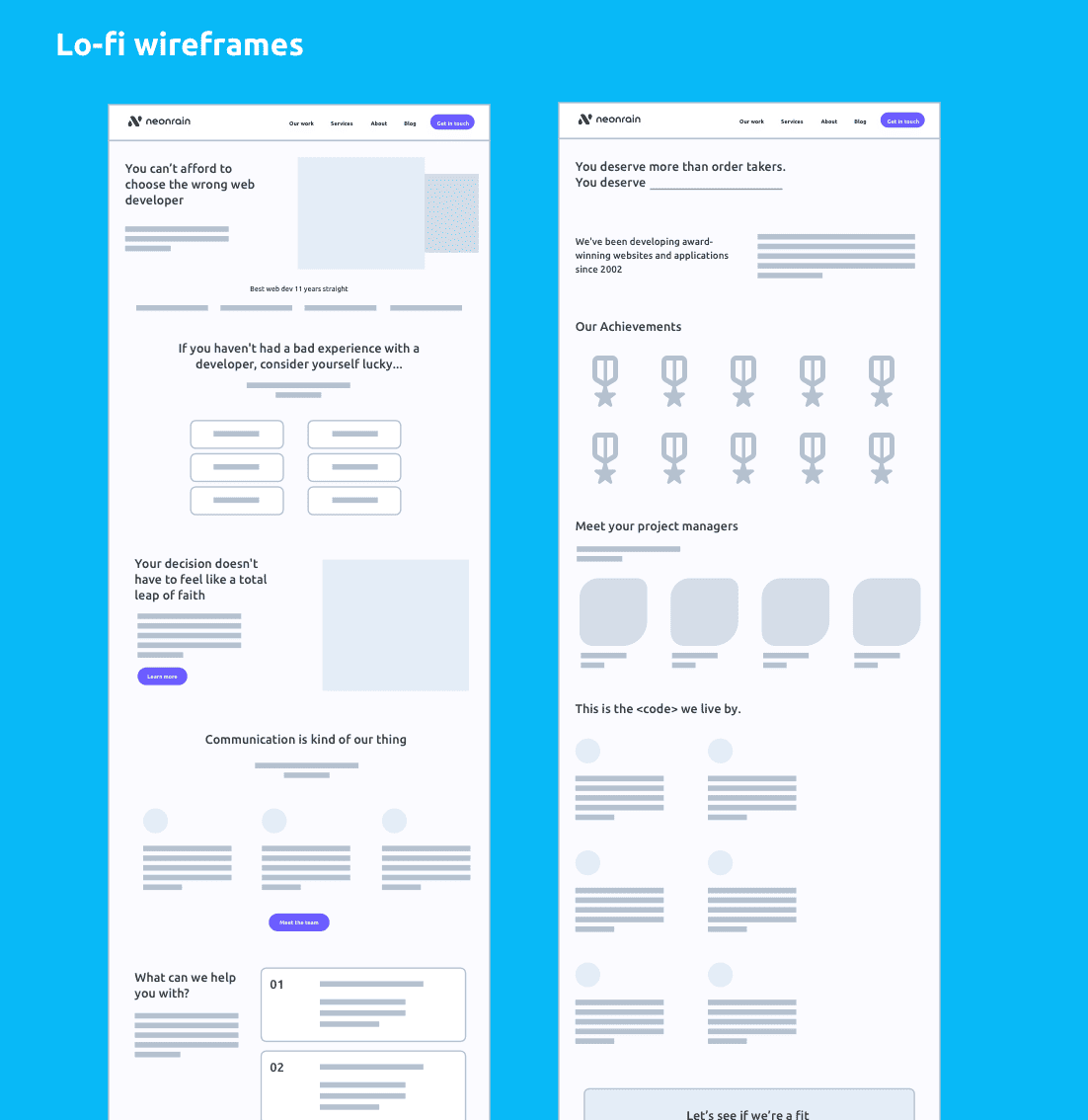
Wireframes
Website Design
UX Design
UI Design
Design System
Visual Identity Design
The client
Neon Rain is an award winning Colorado web development agency. They offer everything from product development to native mobile app creation. They have been in the industry since 2002 with numerous happy clients like Geico and Sprint.
How did we help?
We created an entirely new brand, visual system and website design for Neon Rain. We also partnered with them to produce a number of client website designs.
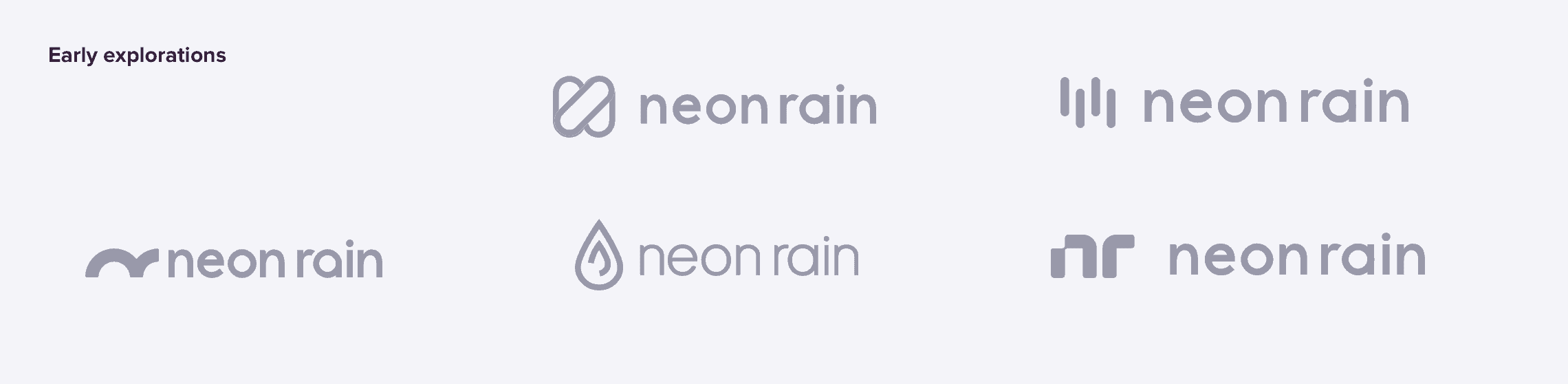
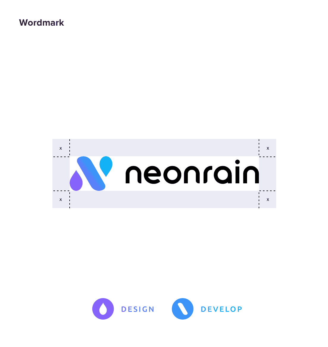
Brand strategy
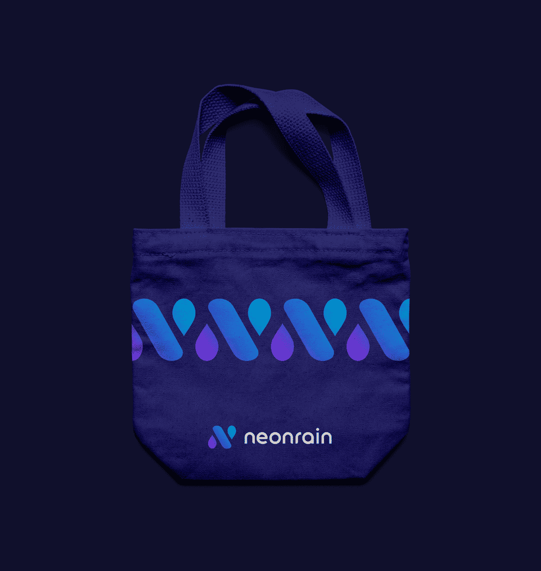
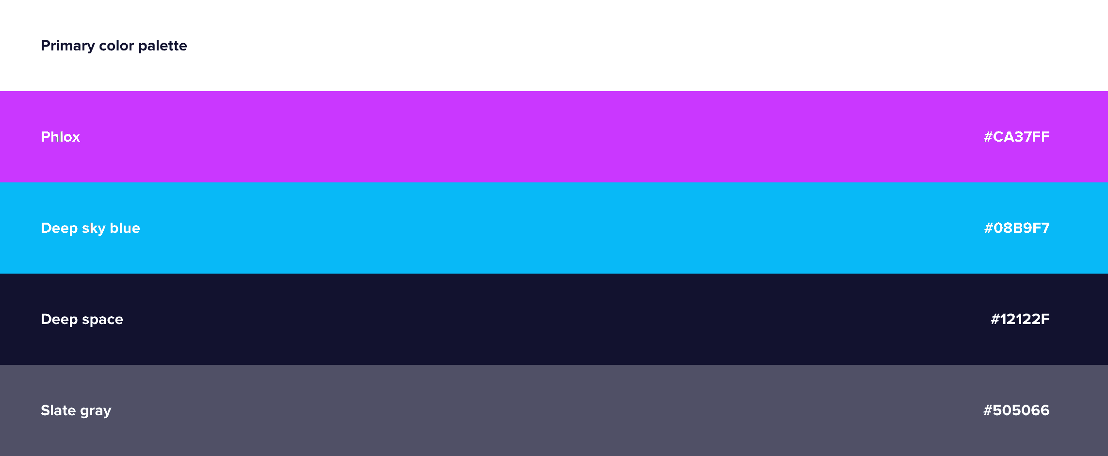
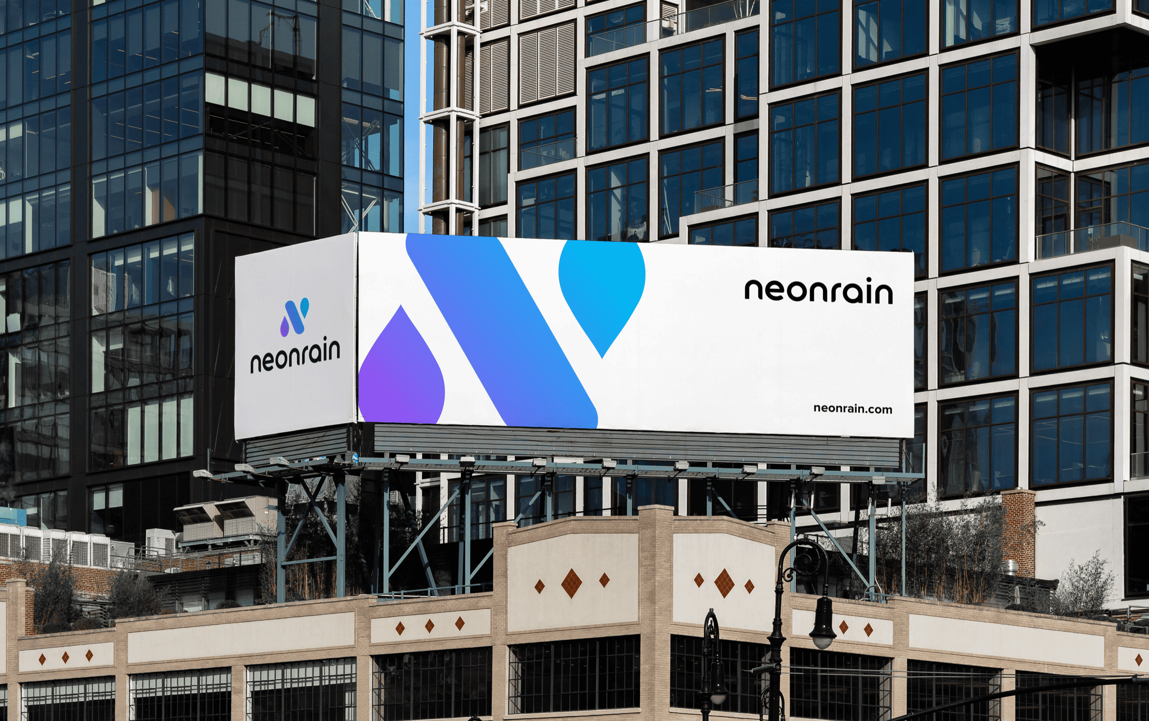
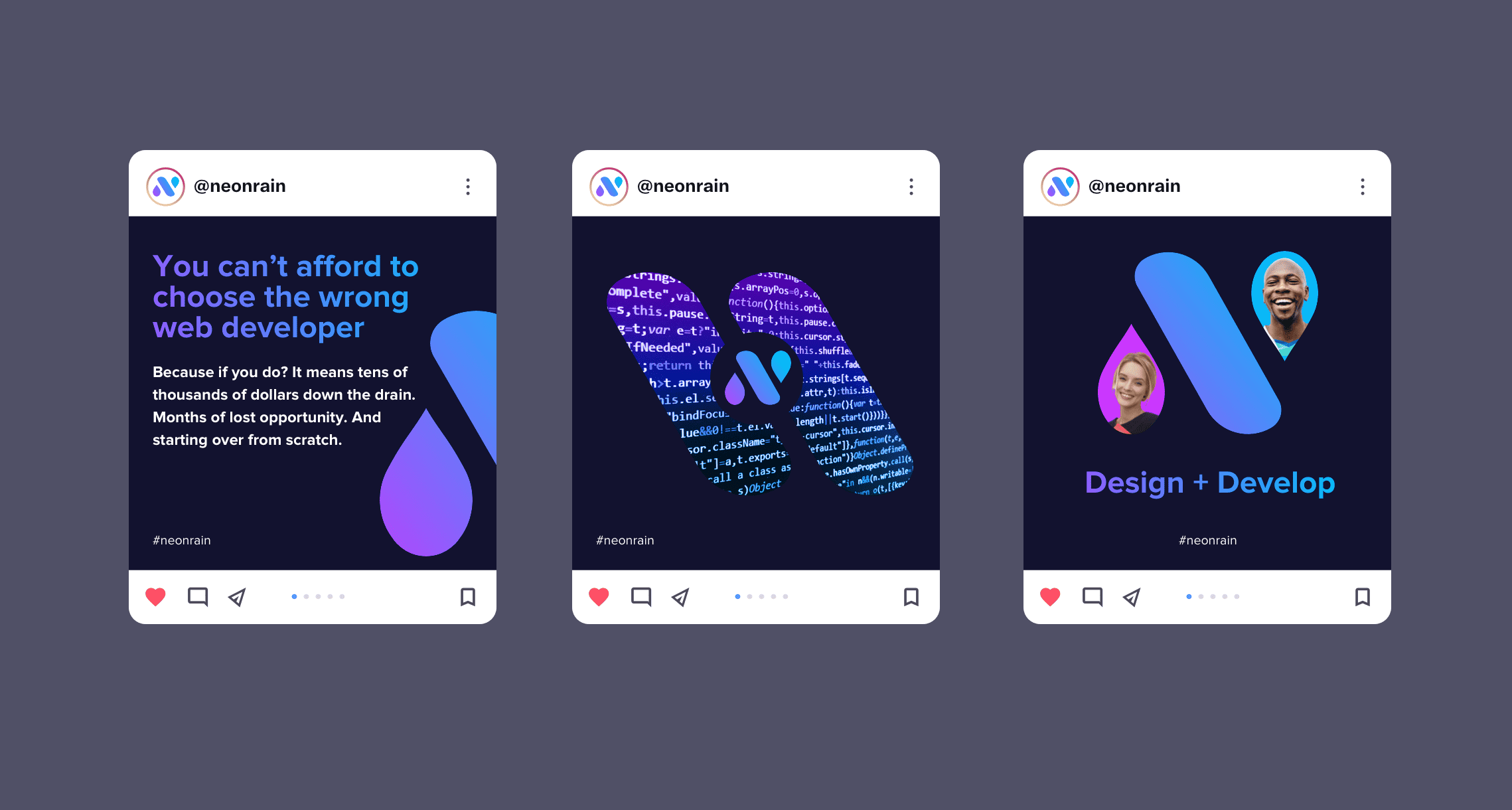
We worked with Neon Rain to produce a new brand that is fresh and speaks to their offering and personality. We arrived at an “N” symbol that is created from the elements of thor services, an ink droplet symbolizing design and a backslash symbolizing development. The structure of the mark also visualizes their namesake. The purple/blue gradient symbolizes the neon colorway found in a modern coding program, along with the energetic vibe of the company.
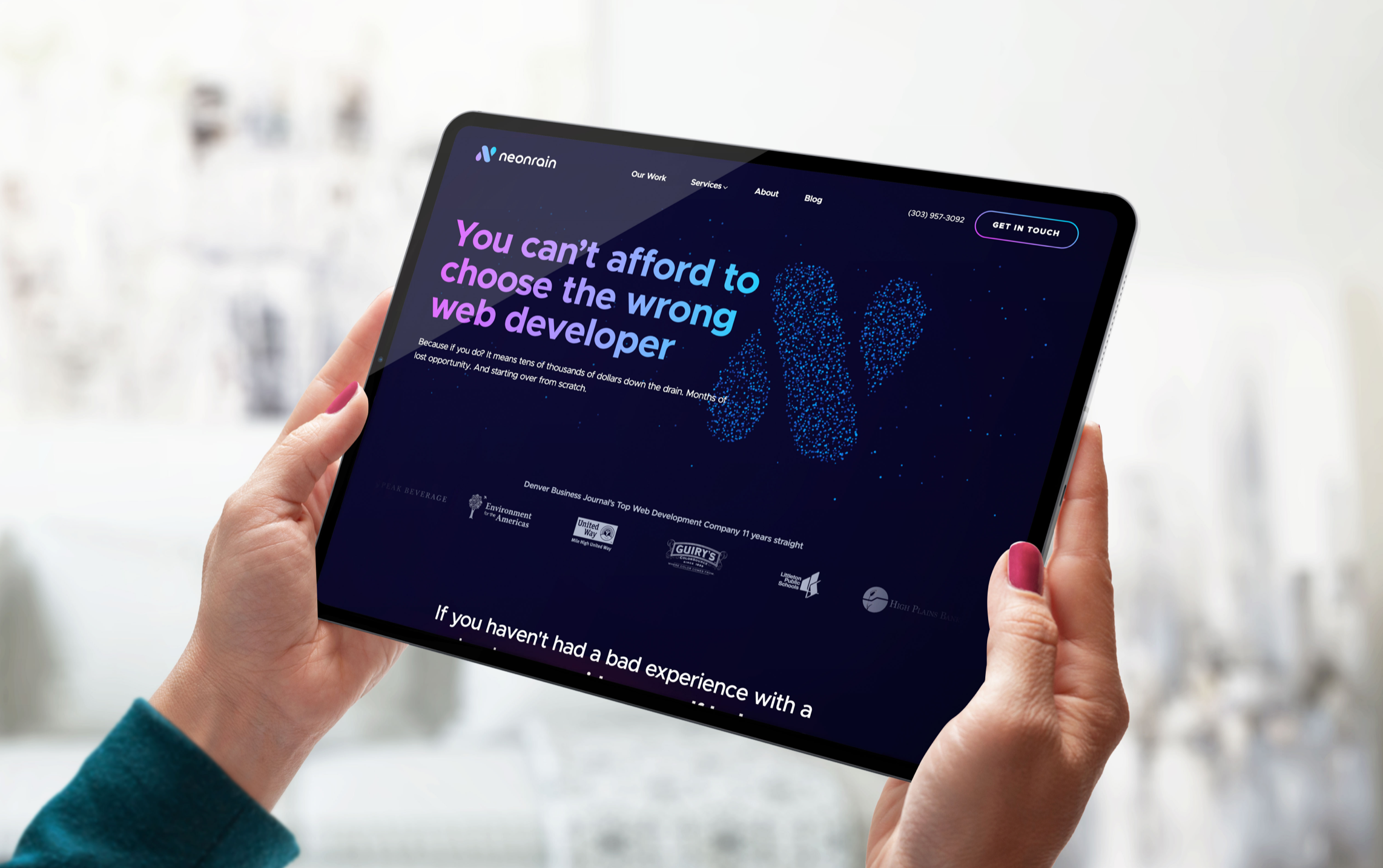
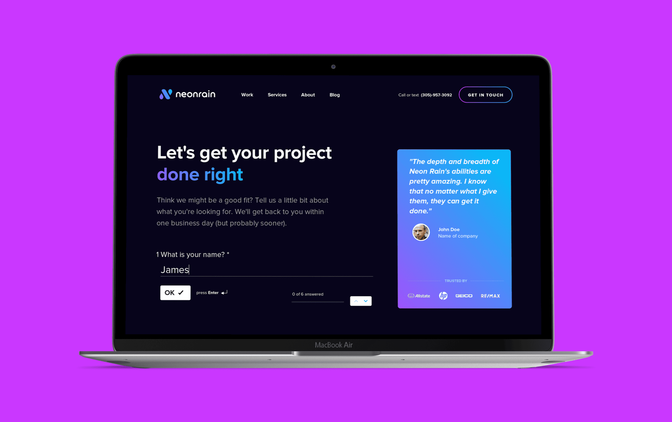
The new website
Neon Rain’s new website was designed to stand out with a dark color-way and an emphasis on “Neon” visuals. We worked to create meaningful depth through frosted glass overlays and subtle gradients throughout the backgrounds. The result is a fresh looking website with a visually appealing feel, rooted in the company name and personality.
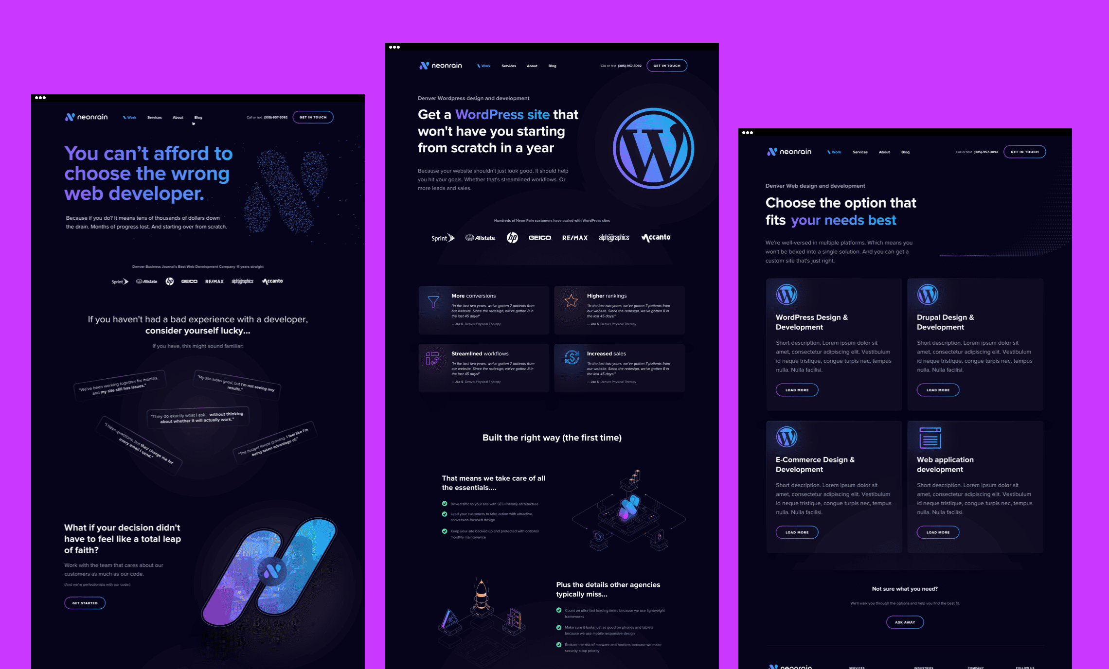
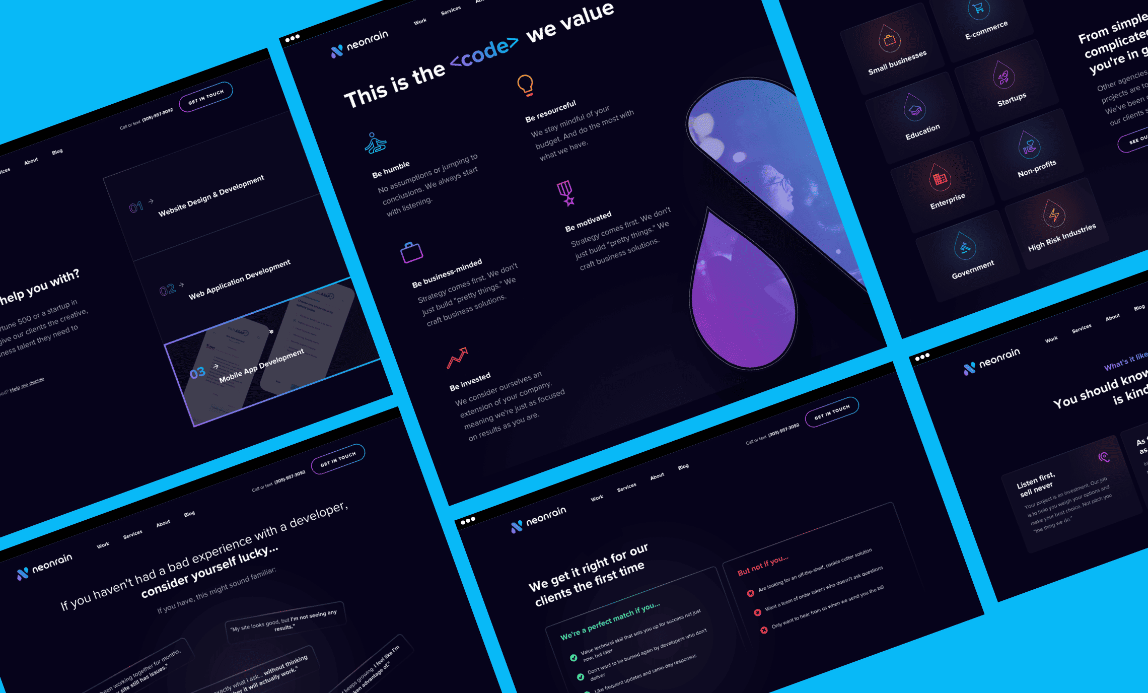
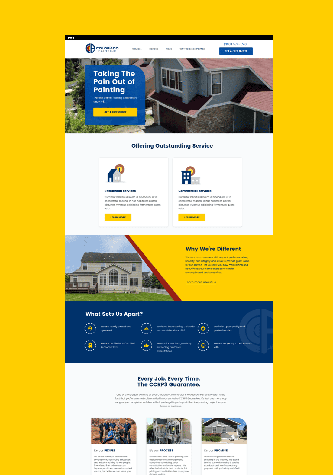
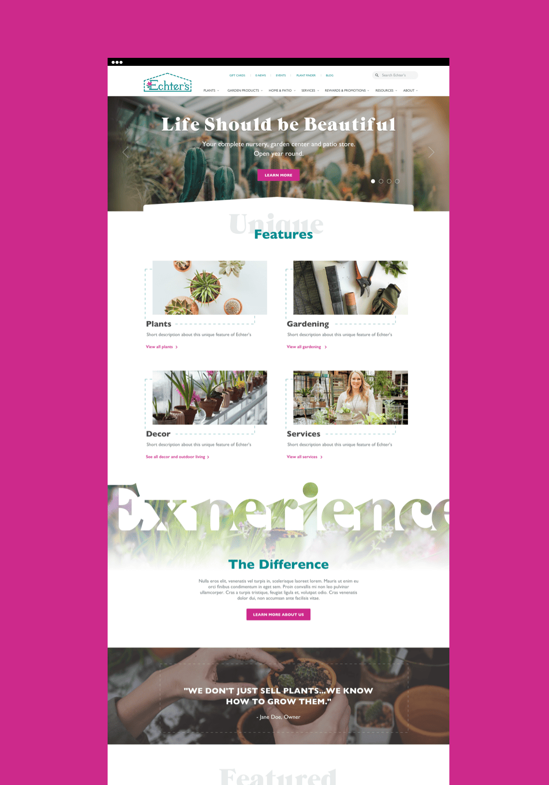
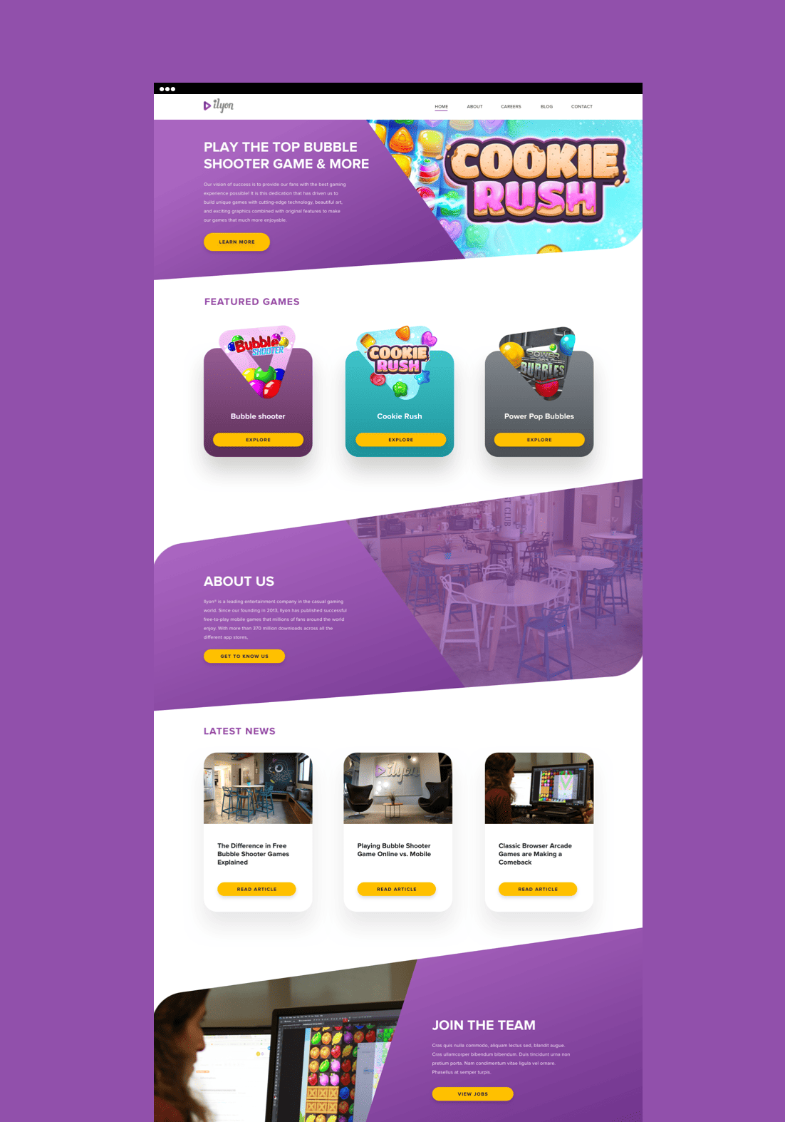
Beyond the brand
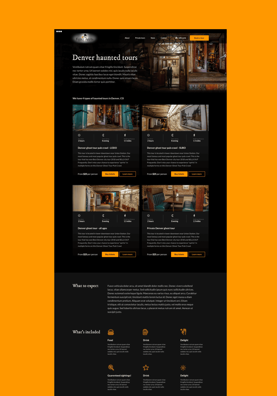
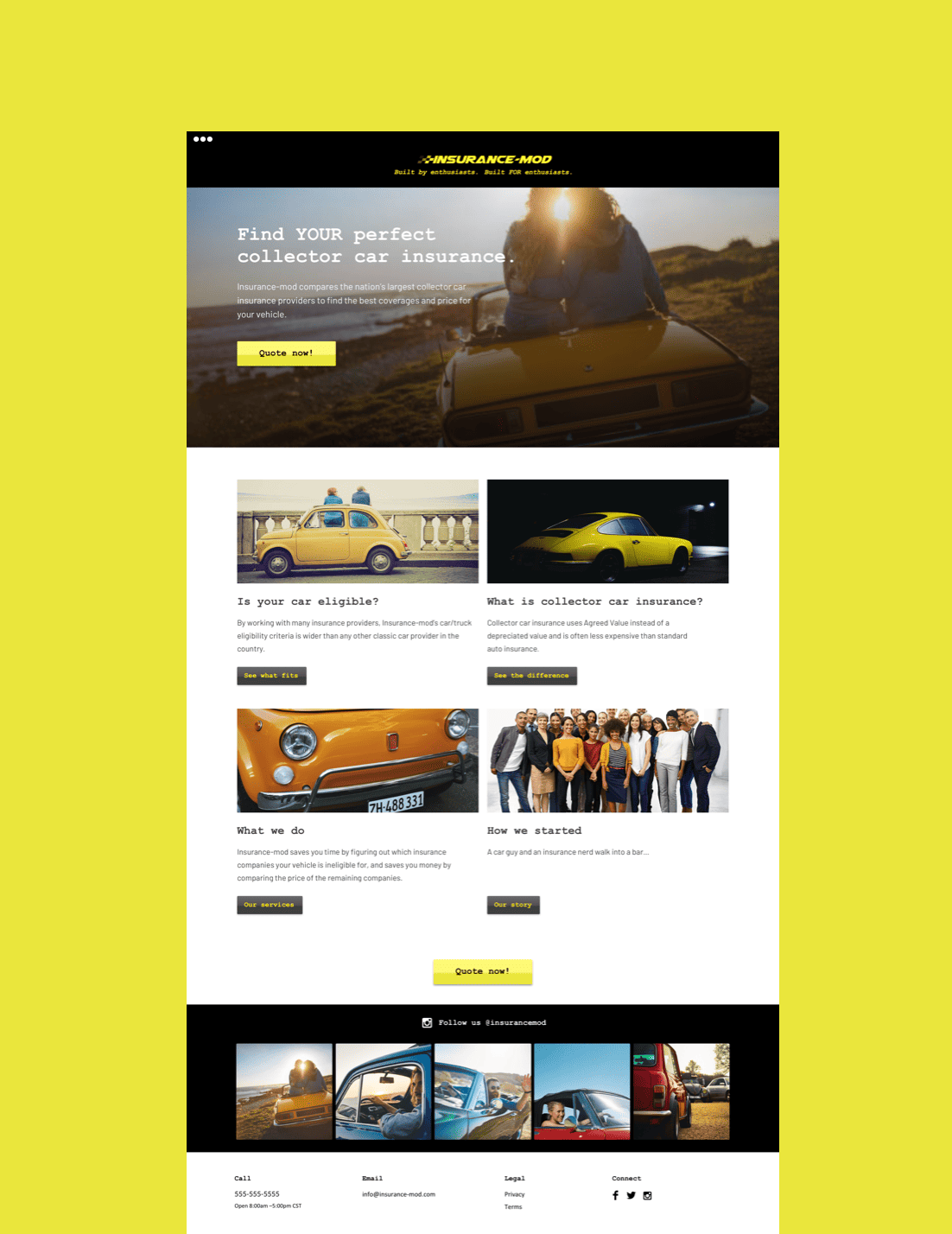
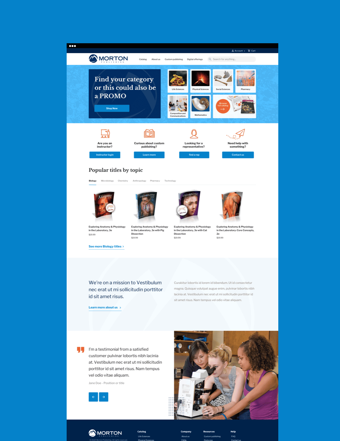
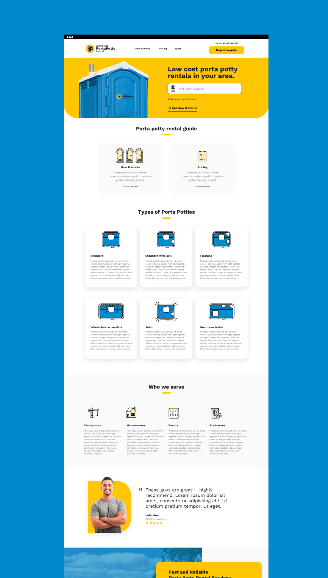
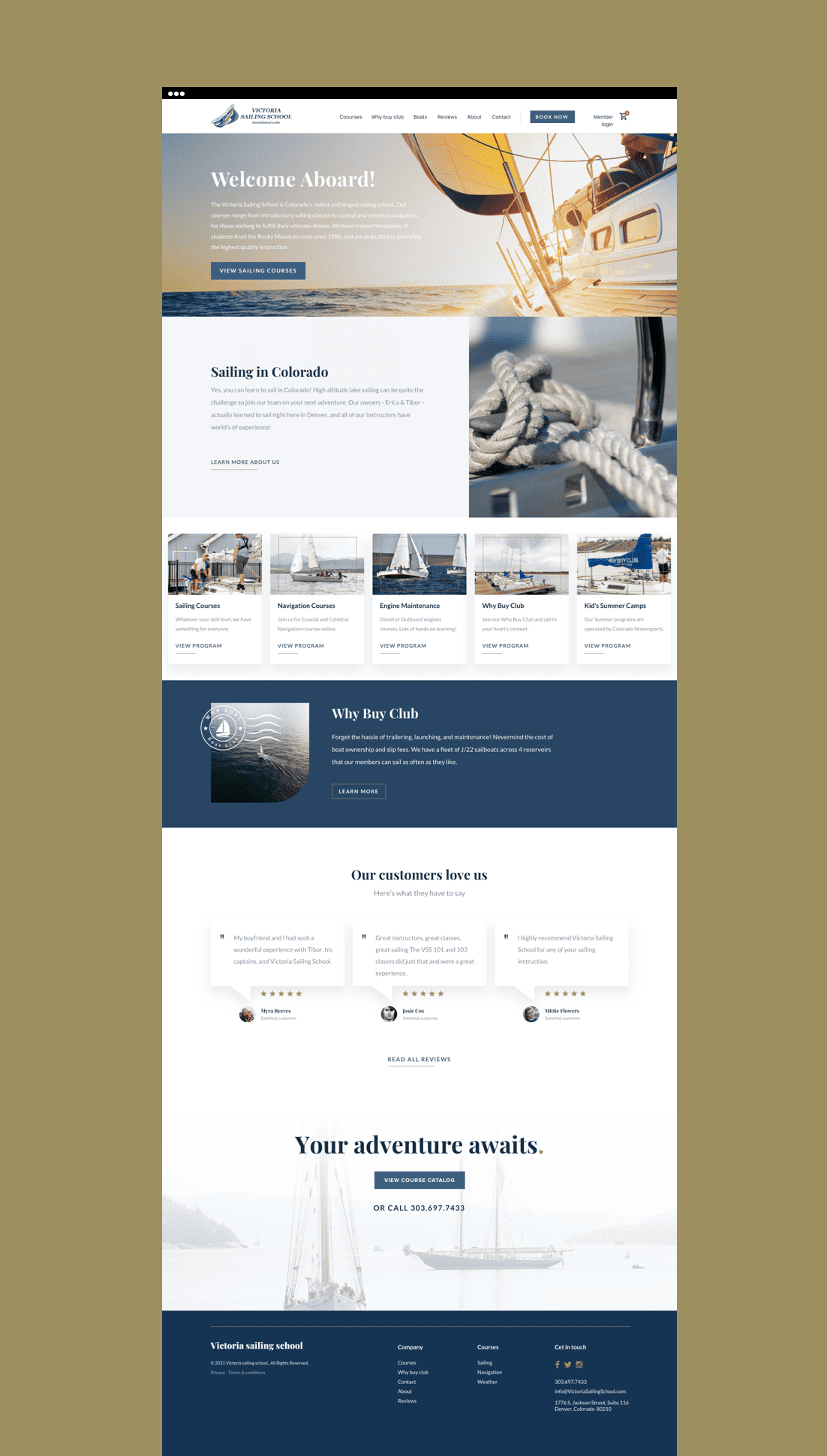
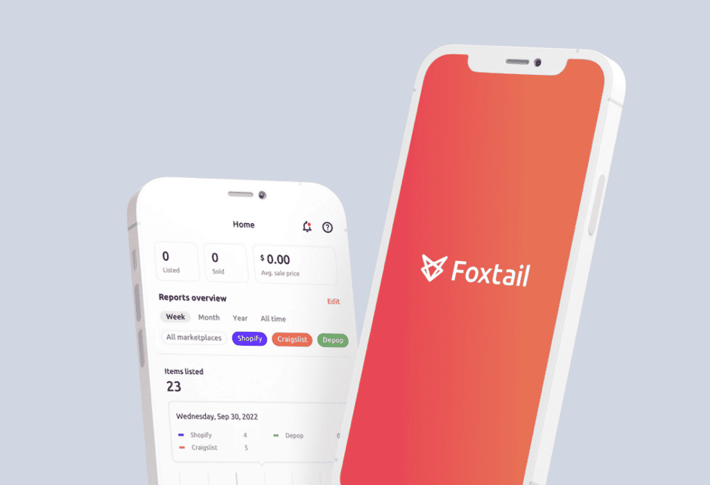
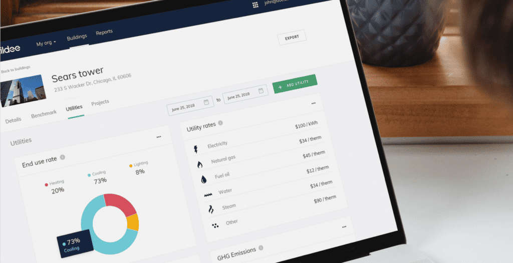
In addition to the new brand and website, we worked with Neon Rain as a design partner to create a number of website layouts from start to finish.
The result
In partnering with Neon Rain we produced a scalable brand system designed to clearly communicate the value of working with their team. We were also lucky enough to experience working with them first-hand and assist in their bringing beautiful visual solutions to their trusted clients.